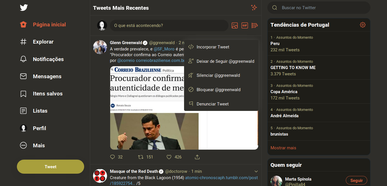
I got the new, event and flex-based, Twitter design a few days ago and decided to try out the night mode. This was also influenced by some tweet a contact of mine published.
While not bad, I don’t like what I think is an exaggerated use of blue hues and shades. I find it even worse at night, due to the blue light stuff impacting our sleep. Even with a blue light filter, like the one from Plasma, it’s still too much blue.
I understand blue is part of Twitter’s brand, but even so… Too much blue!
So, I decided to change the stylesheet to use warmer colors. I used Stylus, an extension for Firefox and Chrome, to save and apply the changes and make using Twitter a better experience.
This is still a work-in-progress, so bear that in mind. Here are the stylesheet changes:
body {background-color: rgb(47, 46, 42) !important;} .r-yfoy6g {background-color: rgb(47, 46, 42) !important;} .r-1uaug3w {background-color: rgb(30, 29, 24) !important;}
.r-111h2gw {color: rgb(198, 195, 141) !important;} .r-aaos50, .r-r72n3l, .r-1nvv5a4 {background-color: rgba(0,0,0,0.2) !important;} .r-13gxpu9 {color: rgb(227, 96, 61) !important;} .r-zv2cs0 {background-color: rgba(255,255,255,0.1) !important;} .r-p1n3y5 {border-color: rgba(227, 96, 61,0.8) !important;} input {color: rgb(198, 195, 141) !important;} .r-urgr8i {background-color: rgb(168, 159, 60) !important;} .r-1q3imqu, .r-ny3pxa {background-color: rgb(159, 147, 7) !important;}
.r-f8p6my {background-color: rgba(0, 0, 0, 0.5) !important; filter: blur(20px) !important;}
.r-1ila09b {border-bottom-color: rgba(255,255,255,0.07) !important;} .r-18bvks7 {border-color: rgba(255,255,255,0.07) !important;}
.r-1n1174f {color: rgb(99, 171, 216) !important;}
.r-xnswec {box-shadow: rgba(255, 255, 255, 0.08) 0px 0px 25px, rgba(255, 255, 255, 0.04) 0px 0px 7px 1px !important;}
